Dear Madelaine,
I want to have my home repainted, but I’m having a really hard time committing to a color – I don’t want to pick the wrong one. Are there any universally successful or timeless colors you can recommend?
This one is really tricky! Paint colors are affected by a wide variety of factors, like:
- Natural Light Exposure: What direction do your windows face? In the Northern hemisphere, southern exposures get the greatest quantity and duration of light throughout the day, while direct eastern and western exposures can be quite intense, albeit fleeting. Northern exposures are the most consistent, but also the least direct and powerful.
- Natural Light Intensity: Is your home street facing with more direct light, or rear facing with more ambient light? Do you have open city views on the 20th floor, or are you looking directly onto another building?
- Electric Light Configuration: Do you rely solely on ceiling lights (so the light is directly coming from above) or do you prefer table and floor lamps (the light is more ambient at eye level)? Are your lights a soft warm white (2700k) or a cooler and bluer white (4000k)?
- Surrounding Materials: Our eyes perceive color relative to surrounding elements, so think about your overall color palette (floors, cabinets, tile, furniture, rugs, drapery, etc..) when selecting a complementary paint color.
All that being said, there are a few colors that almost always seem to work beautifully in any space.
A clean yet warm white:
Benjamin Moore Simply White OC-117
White is one of the trickiest paint colors to select because the absence of base pigment makes the undertones read more strongly. Too much gray feels dingy, too much blue feels cold and clinical, and too much yellow feels dirty. Simply white is just that; minimal undertones for a clean, crisp, but still warm and inviting white. It goes with every color palette and is the definition of timeless.

An elegant and delicate cream:
Farrow & Ball White Tie 2002
If the idea of white walls feels too sterile but you’re looking for a timeless lightly colored neutral, White Tie is a beautiful choice. The light vanilla brings a gentle warmth to a space and the touch of black (Farrow & Ball’s signature) deepens and grounds the color. It is the perfect complement to a natural grasscloth wallpaper where white would be too stark.

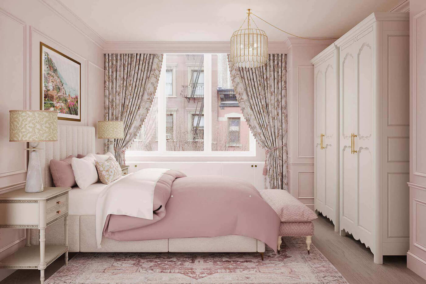
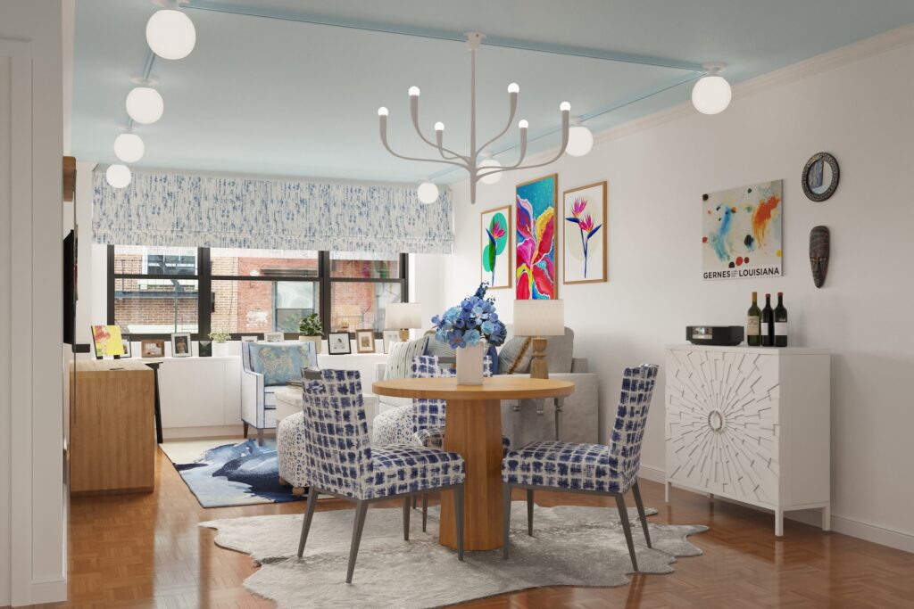
A lovely light blue:
Benjamin Moore Cumulus Cotton 2063-70
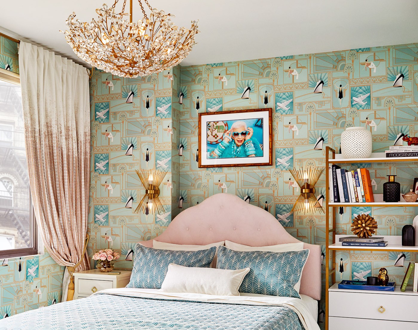
I love a light blue ceiling in an apartment; it’s unexpected but not overpowering and evokes the sky which instantly makes a space feel lighter and brighter. The trick is not going too bold or too grey, and Cumulus Cotton strikes the perfect balance that will never feel tired.

A rich luxurious black:
Sherwin Williams Black Magic SW6991
Black walls are a statement and if you’re going to do it, you have to go all in. Blacks that are too light tend to look faded and washed out; Black Magic is rich and velvety and I never get tired of looking at it.

Want to discuss more specific colors for your home?
Book a call and we can figure it out together!
Till next time…
Madelaine
PS – Do you have design questions? Send us an email at info@designbyadroit.com and we will answer it as quickly and completely as possible in an upcoming blog post!